UI/UX
AI workflow
Vibe coding
Role
UI/UX Designer
Context
Hackathon to Solo iteration
Team
Dev, Marketing
Tools
Figma, Lovable, Claude
Year
2026
A peer-to-peer AI learning platform designed from hackathon brief to clickable prototype in one sprint. Built with Figma, Lovable, and Claude as a thinking partner.

Peer to peer learning platform within a company about AI
Speed up workflow with AI tools: 248 Lovable prompts, 75 Claude chats
Clickable product prototype
What the Hack
Peerly started as a hackathon-challenge brief from Langdock: design peer-to-peer AI learning for companies. Three people, one afternoon. After the hackathon I kept going solo. Updated persona, real visual system, documented interaction thinking, a clickable prototype. This is that iteration.
Hackathon first concept
I worked in a team of three for four to five hours: one designer (me), one developer, one marketing student. We brainstormed, aligned on a core mechanic, and built a first prototype.
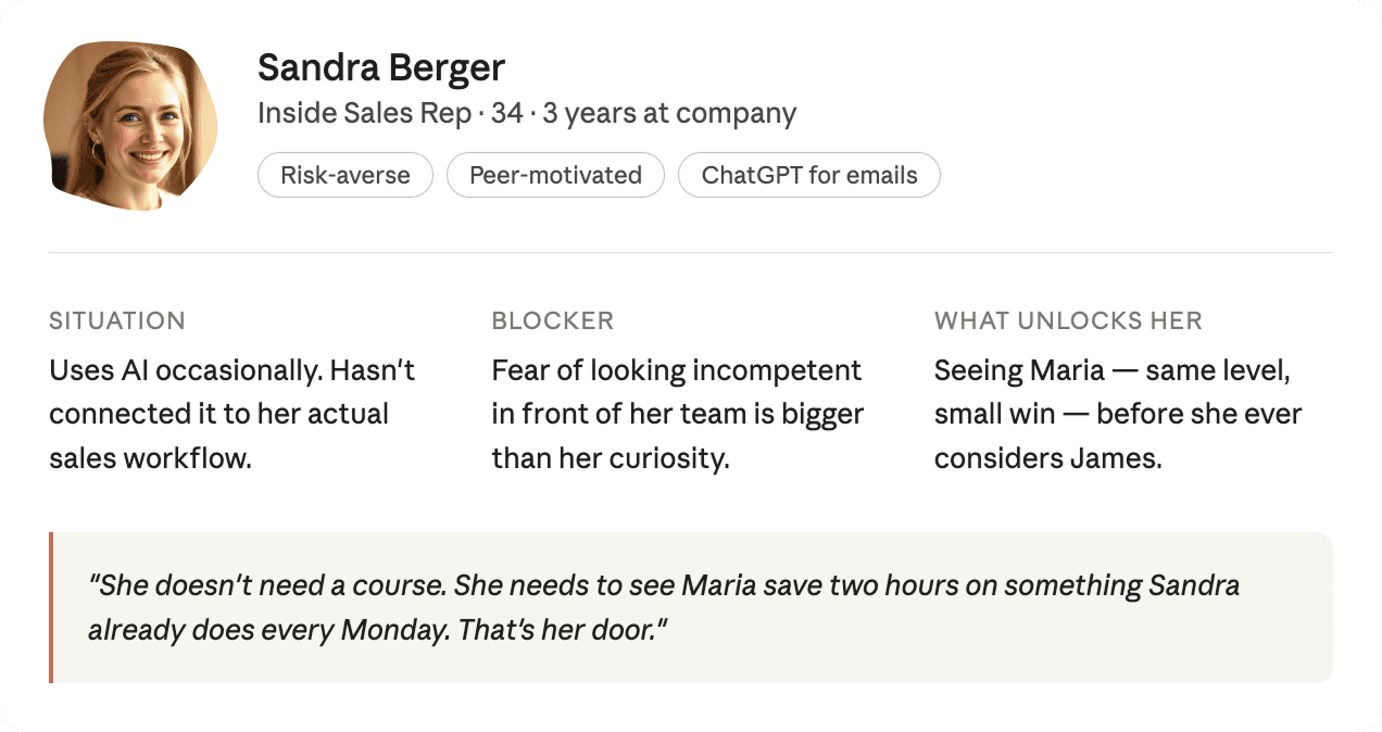
Most employees like Sandra feel overwhelmed by AI, don't know where to start, and learn informally through conversations that disappear. The opportunity was to make that knowledge structural and discoverable within a company.


After the hackathon I continued the project alone to design it properly, with a specific user, a real visual system, and interaction thinking
User story
Sandra logs in with her company account and lands on her dashboard. She sees that Maria, same role as her, saved two hours on Monday with an AI prompt for sales follow-ups. She opens it, reads through what Maria did, and clicks "show me the prompts she used." One tap later the prompt runs in her own AI workspace, rewritten around her accounts and talking points. She just did what Maria, her colleague did - without taking a course.

Issues
Peer learning at work happens in scattered conversations that disappear, no structure, no discoverability, no way to build on them
The first prototype was conceptually right but visually underdeveloped and missing key interaction thinking.
First entry point looks like every AI tool: a chat. What would Sandra ask?
No contribution flow, no clear user journey, no visual identity.

Goal
" transform="translate(5.769 2.044)" width="4.80488020049448px"/><path d="M 5.628 0.023 C 6.138 -0.092 6.643 0.238 6.755 0.759 C 6.868 1.28 6.544 1.796 6.034 1.911 C 6.034 1.911 6.033 1.911 6.032 1.911 C 6.031 1.912 6.028 1.912 6.025 1.913 C 6.018 1.914 6.008 1.917 5.995 1.92 C 5.97 1.926 5.932 1.934 5.885 1.944 C 5.791 1.966 5.659 1.996 5.507 2.031 C 5.204 2.101 4.828 2.189 4.526 2.262 C 4.071 2.374 3.359 2.726 2.794 3.184 C 2.497 3.425 2.295 3.848 2.039 4.523 C 1.905 4.876 1.868 5.444 1.907 6.119 C 1.945 6.782 2.04 7.355 2.089 7.786 C 2.152 8.335 2.377 8.838 2.684 9.734 C 2.911 10.399 3.204 10.804 3.572 11.07 C 4.047 11.412 4.602 11.618 5.288 11.907 C 5.506 11.998 5.845 12.06 6.287 12.066 C 6.717 12.073 7.186 12.026 7.623 11.946 C 7.889 11.897 8.102 11.777 8.337 11.584 C 8.461 11.482 8.58 11.37 8.724 11.234 C 8.86 11.106 9.025 10.949 9.203 10.806 C 9.677 10.427 10.023 9.95 10.508 8.873 C 10.919 7.961 11.031 7.314 11.084 5.8 C 11.1 5.329 11.124 4.838 11.096 4.365 C 11.067 3.874 10.987 3.549 10.886 3.373 C 10.622 2.913 10.773 2.32 11.223 2.05 C 11.674 1.78 12.254 1.935 12.518 2.395 C 12.851 2.976 12.95 3.677 12.984 4.248 C 13.019 4.836 12.989 5.442 12.974 5.869 C 12.917 7.501 12.787 8.438 12.227 9.681 C 11.686 10.882 11.184 11.677 10.37 12.328 C 10.264 12.413 10.155 12.515 10.01 12.652 C 9.874 12.78 9.706 12.94 9.521 13.092 C 9.136 13.408 8.635 13.725 7.954 13.849 C 7.423 13.946 6.833 14.007 6.261 13.999 C 5.701 13.991 5.094 13.916 4.567 13.695 C 3.997 13.455 3.177 13.151 2.482 12.65 C 1.71 12.093 1.218 11.309 0.898 10.374 C 0.664 9.689 0.305 8.841 0.21 8.01 C 0.174 7.697 0.061 6.967 0.018 6.233 C -0.024 5.511 -0.015 4.588 0.275 3.824 C 0.508 3.21 0.861 2.284 1.618 1.67 C 2.359 1.068 3.317 0.57 4.086 0.382 C 4.4 0.305 4.787 0.215 5.092 0.145 C 5.245 0.109 5.38 0.079 5.475 0.058 C 5.523 0.047 5.561 0.038 5.588 0.032 C 5.601 0.029 5.611 0.026 5.618 0.025 C 5.621 0.024 5.624 0.024 5.625 0.024 C 5.626 0.023 5.627 0.023 5.627 0.023 Z" fill="rgb(0, 102, 71)" height="14.000000000000004px" id="NaACzaWyi" transform="translate(1.236 2.044)" width="12.999999990113576px"/></svg>)
Design a complete, clickable product prototype for the learner side of the platform.
Make a playful, easy entry point for Sandra's learning.
Learning tailored to the users actual daily tasks.
Coherent visual language and documented UX decisions.
Use AI (Claude, Lovable) for faster iteration
My workflow
I debated and defined in Claude, sketched and explored in Figma, then generated and iterated in Lovable. The AI workflow was not about shortcuts, it was about having a thinking partner that could pressure-test decisions in real time.
Iteration


Lovable first output

Correct structure, wrong feeling. The card grid and blue buttons read as generic SaaS or a blog. Nothing communicated that this was a personal, peer-driven product. (At the end of the case study you can see how I debated with Claude about product decisions.)

Figma sketch

I went back to Figma to solve two things: the visual metaphor (what does Sandra's space look like versus the team's space?) and the shape language (what makes this product feel different from every other dashboard). The split background and blob emerged from that session. Not as decoration, but as visual solution to those questions.
The sketch locked two principles: above the wave and on the surface is Sandra's personal space, below is the platform's collective world. And the blob appears only where the platform speaks to her directly.

Lovable final iteration
Back to Lovable with prompts which were created by me and Claude. SVG assets for the blob and wave, exact color tokens, asymmetric card corners. The goal was to transfer design intent, not just visual style.
I adapted the visuals and color tokens to the lovable prototype.
Key UX decisions
Two banners, not one
The original prototype had one aspirational story: James closing a $1.2M deal. Sandra looks at James and feels behind, not inspired. I added a second story type alongside it. Maria, same level, small win, is Sandra's entry point. James is her aspiration. Social proof before aspiration for someone nervous about AI.
Wall of Wins, not a leaderboard
A traditional leaderboard puts Sandra near the bottom. She sees it, feels bad, and leaves. The Wall of Wins reframes recognition around three categories: biggest time save, most borrowed prompt, rising learner. Sandra can appear as a Rising Learner in week one.
Two AI chats
Two chat interfaces exist in the product. The James chat rail is warm, beige, contextual, for learning. The personal AI workspace modal is clean, full-width - for doing. The visual contrast communicates the mode switch without explaining it.
The coffee ladder
Asking Sandra to book a coffee with James straight away is too big a step. So connection is progressive: bookmark a prompt, then send a one-tap thank-you, then request a coffee or join an office hour. Each step unlocks the next. It bridges digital learning and real human connection without pushing anyone too fast.
Visual language
The split background, warm beige above the wave, deep dark below, both aesthetic and conceptual. Above the fold is Sandra's personal space. Below the fold is the platform's (company) collective world.
Terracotta means do something. Blue means know something.
The blob shape appears only where the platform speaks to Sandra personally: her progress widget, her avatar, her loading screen.
Prototype
The prototype was built with Lovable. Open it to click trough Peerly.

Designing with AI
I used Claude as a thinking partner throughout to debate. Here are some summarized chats.


Thoughts
OUTPUT
PEER STORIES AS ENTRY POINT
Replaced the typical course catalogue mechanic with real colleague stories, always showing a same-level peer alongside an aspirational one.
TRANSPARENT PERSONALISATION
Turned a data privacy into a trust-building onboarding moment by showing Sandra exactly what the system knows before using it.
PLAN EARLY
The most surprising thing was how much the AI-assisted workflow changed when decisions got made. Debates about the leaderboard, the data consent screen, the blob's role happened before anything was built. That forced me to articulate why earlier than usual. It's the part that normally gets skipped.
AI AS DESIGN PARTNER
Using Claude for pressure-testing, not generation, was the right call. The split background, the coffee chat, the blob as a personal signature were my ideas. The conversations named the principles behind them, which made decisions easier to defend and document.
takeaways
FIGMA EARLIER
I'd start the visual system earlier next time. Locking color tokens and shape rules in Figma before building would have saved a lot of prompted fixes in Lovable.
TALK TO ME
Two AI tools, two different jobs. Claude for the thinking (150 messages), Lovable for the building (248 prompts, 216 credits).
TEST AND ITERATE
I would run a first user test with someone matching Sandra's profile to further investigate how the learning content and the look and feel is experienced.
FURTHER DEVELOPMENT
The learner side is built. The skill sharer side is not. The next sprint would design the contribution flow: a prompt triggered inside the companies AI-tool after a successful session to share the prompt on the platform, a setting for managing coffee chat availability etc.
