UI/UX
Information Architecture
Role
SR. UX Designer
Company
DKB Code Factory
Team
Dev, PO, QA
Platform
Web
Year
2024
A multi-scenario web onboarding flow for one of Germany's largest banks — I joined during MVP to restructure the UI/UX, fix the UX writing, and make it actually usable for both users and developers.
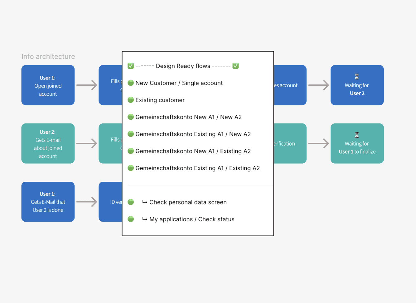
Web flow handling 4 distinct user scenarios (single/joint × new/existing customer)
Refined key screens (wording, layout, hierarchy) to improve clarity and reduce friction
Cleaned developer handover files — reduced ambiguity and open questions
Designed to support higher completion rates and lower drop-offs
What was going on
I joined the project during the MVP phase to refine and stabilize the web onboarding flow for the DKB Bank account. I reworked the UI/UX, improved the information architecture, and ensured clean, structured design files for a clear and efficient developer handover.
Issues
Complex flows (single & joint accounts) with inconsistent structure and unclear dependencies
UX Writing: Unclear titles, wording
UI imperfections
Lack of clarity in developer handover
Goal
" transform="translate(5.769 2.044)" width="4.80488020049448px"/><path d="M 5.628 0.023 C 6.138 -0.092 6.643 0.238 6.755 0.759 C 6.868 1.28 6.544 1.796 6.034 1.911 C 6.034 1.911 6.033 1.911 6.032 1.911 C 6.031 1.912 6.028 1.912 6.025 1.913 C 6.018 1.914 6.008 1.917 5.995 1.92 C 5.97 1.926 5.932 1.934 5.885 1.944 C 5.791 1.966 5.659 1.996 5.507 2.031 C 5.204 2.101 4.828 2.189 4.526 2.262 C 4.071 2.374 3.359 2.726 2.794 3.184 C 2.497 3.425 2.295 3.848 2.039 4.523 C 1.905 4.876 1.868 5.444 1.907 6.119 C 1.945 6.782 2.04 7.355 2.089 7.786 C 2.152 8.335 2.377 8.838 2.684 9.734 C 2.911 10.399 3.204 10.804 3.572 11.07 C 4.047 11.412 4.602 11.618 5.288 11.907 C 5.506 11.998 5.845 12.06 6.287 12.066 C 6.717 12.073 7.186 12.026 7.623 11.946 C 7.889 11.897 8.102 11.777 8.337 11.584 C 8.461 11.482 8.58 11.37 8.724 11.234 C 8.86 11.106 9.025 10.949 9.203 10.806 C 9.677 10.427 10.023 9.95 10.508 8.873 C 10.919 7.961 11.031 7.314 11.084 5.8 C 11.1 5.329 11.124 4.838 11.096 4.365 C 11.067 3.874 10.987 3.549 10.886 3.373 C 10.622 2.913 10.773 2.32 11.223 2.05 C 11.674 1.78 12.254 1.935 12.518 2.395 C 12.851 2.976 12.95 3.677 12.984 4.248 C 13.019 4.836 12.989 5.442 12.974 5.869 C 12.917 7.501 12.787 8.438 12.227 9.681 C 11.686 10.882 11.184 11.677 10.37 12.328 C 10.264 12.413 10.155 12.515 10.01 12.652 C 9.874 12.78 9.706 12.94 9.521 13.092 C 9.136 13.408 8.635 13.725 7.954 13.849 C 7.423 13.946 6.833 14.007 6.261 13.999 C 5.701 13.991 5.094 13.916 4.567 13.695 C 3.997 13.455 3.177 13.151 2.482 12.65 C 1.71 12.093 1.218 11.309 0.898 10.374 C 0.664 9.689 0.305 8.841 0.21 8.01 C 0.174 7.697 0.061 6.967 0.018 6.233 C -0.024 5.511 -0.015 4.588 0.275 3.824 C 0.508 3.21 0.861 2.284 1.618 1.67 C 2.359 1.068 3.317 0.57 4.086 0.382 C 4.4 0.305 4.787 0.215 5.092 0.145 C 5.245 0.109 5.38 0.079 5.475 0.058 C 5.523 0.047 5.561 0.038 5.588 0.032 C 5.601 0.029 5.611 0.026 5.618 0.025 C 5.621 0.024 5.624 0.024 5.625 0.024 C 5.626 0.023 5.627 0.023 5.627 0.023 Z" fill="rgb(0, 102, 71)" height="14.000000000000004px" id="NaACzaWyi" transform="translate(1.236 2.044)" width="12.999999990113576px"/></svg>)
Structured onboarding flows handling 4 distinct user scenarios (single/joint × new/existing customer)
Refined key screens (UX writing, layout, hierarchy)
Redesigned progress stepper, improving orientation
Prepared clean, implementation-ready design files
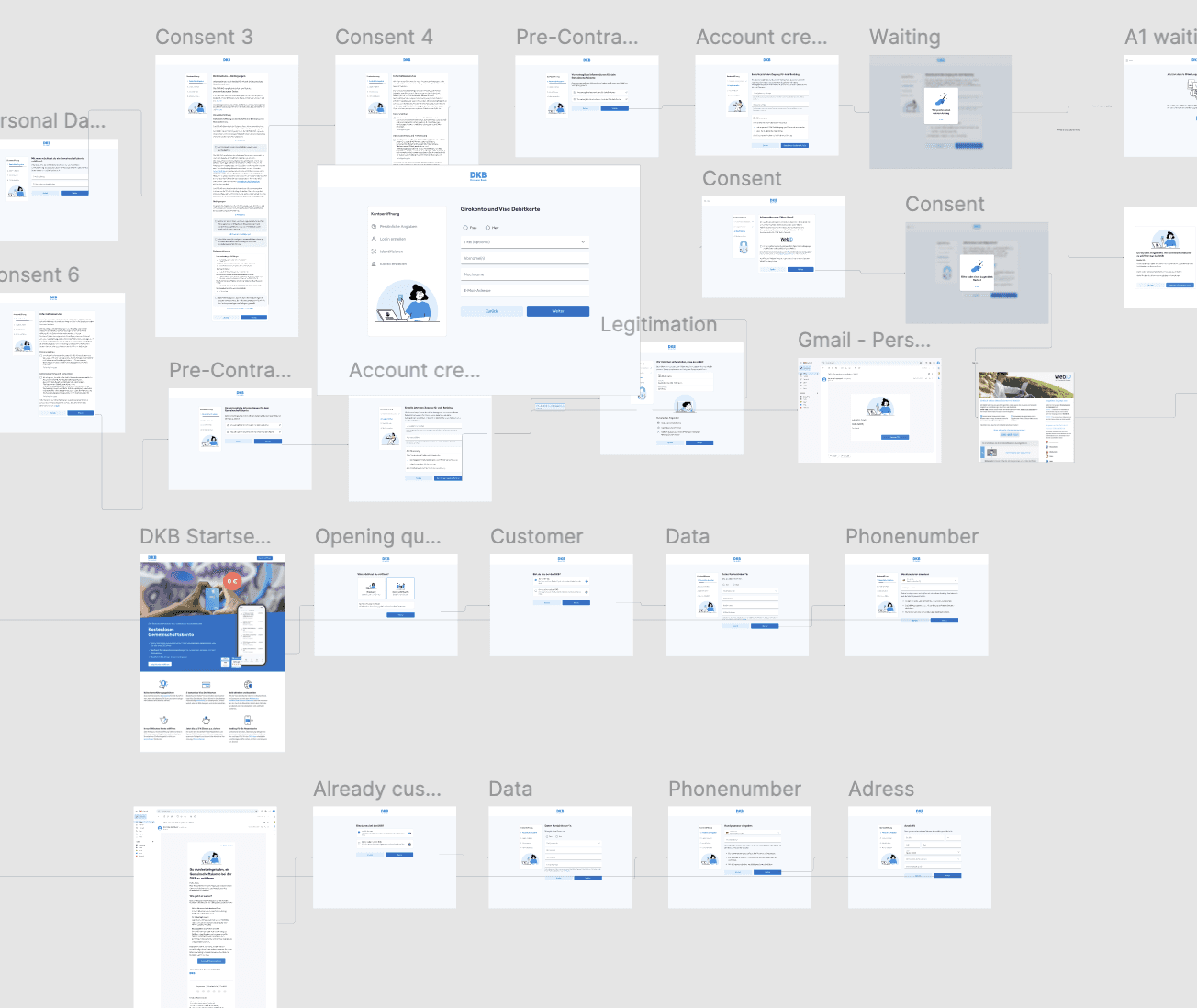
Information architecture
This example shows how I applied the information architecture of the joined account for new users onboarding flow to the Figma files.
By clearly separating the two users, the structure makes a complex flow easier to understand and work with.

Flow 1: New Customer 1+2 for joined account
Flow 2: Existing Customer 1 and new customer for joined account

The onboarding brings multiple scenarios and dependencies. I clearly structured design files for clear developer handover.
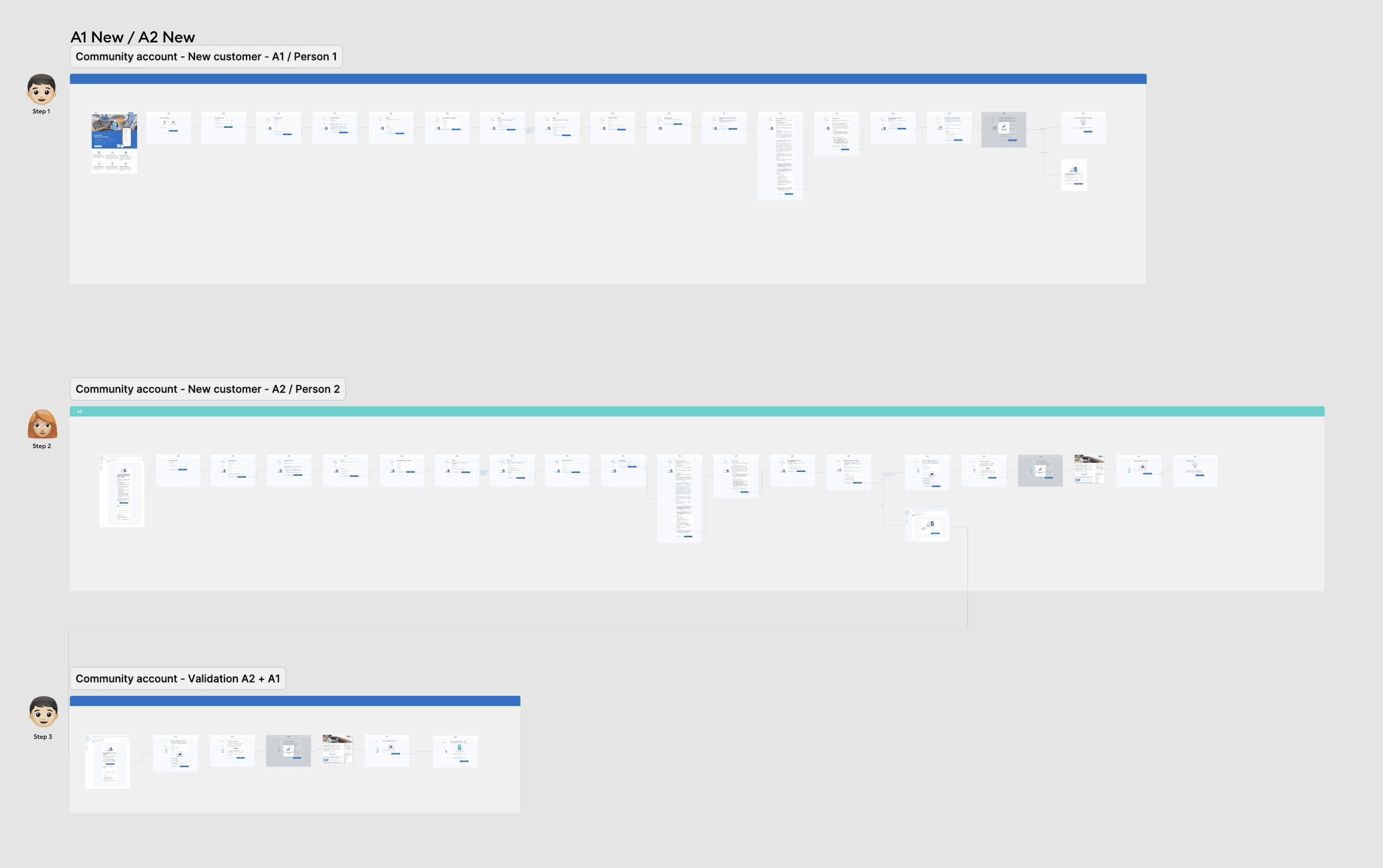
- 1: New Customer 1+2 for joined account
- 2: Existing Customer 1 and new customer for joined account

The whole onboarding flow for a joined account for new customers as a clickdummy for testing
App onboarding animations — from illustration to Lottie
The onboarding screens use animated illustrations to reduce cognitive load at each step — giving users a visual help before they read the instruction. I worked with the illustrator to receive the source files, animated them in Keyshape, and exported production-ready Lottie files for direct handoff to iOS and Android developers.
Lottie format ensured the animations are lightweight, scalable, and consistent across both platforms without additional developer effort.
Let’s smooth the screens
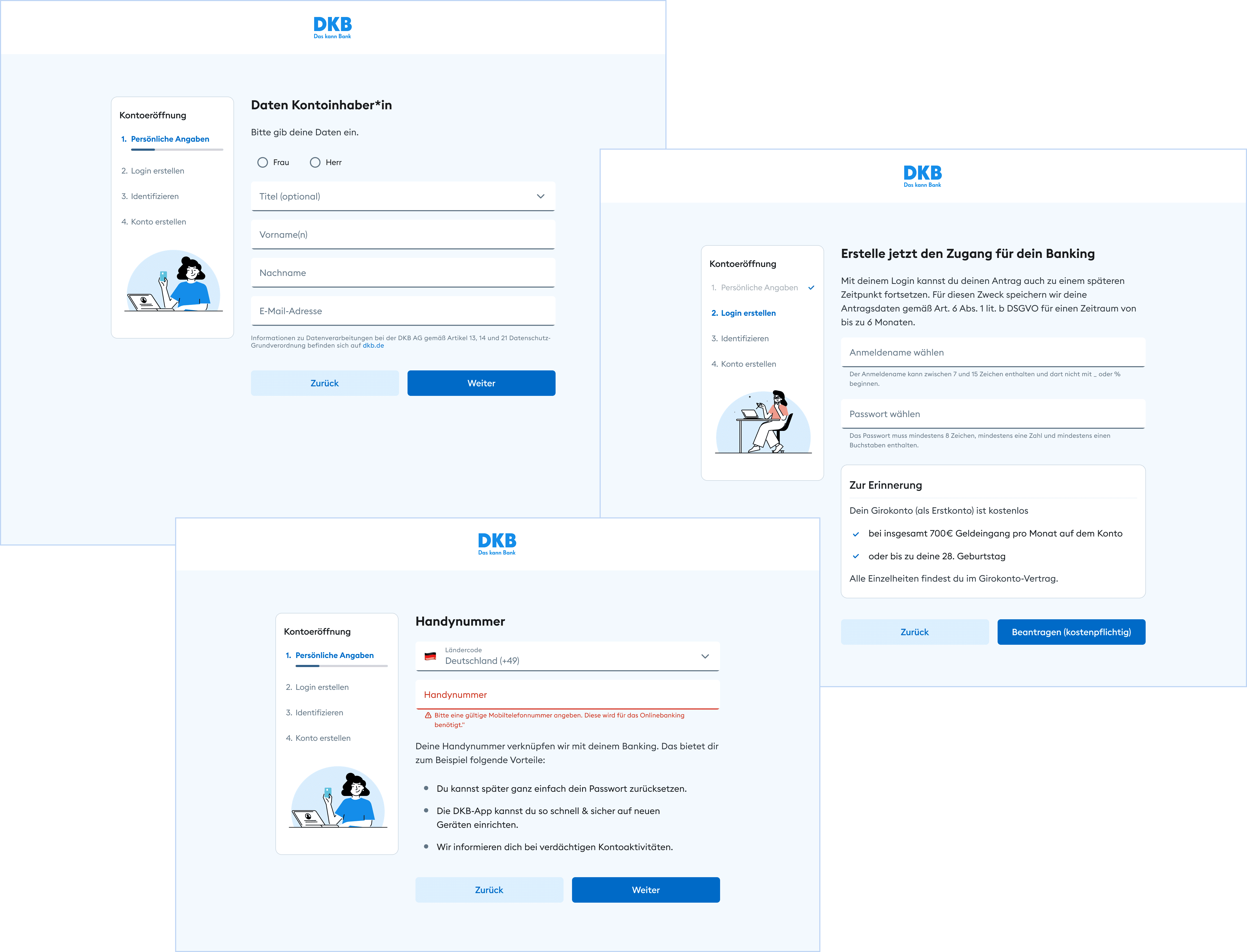
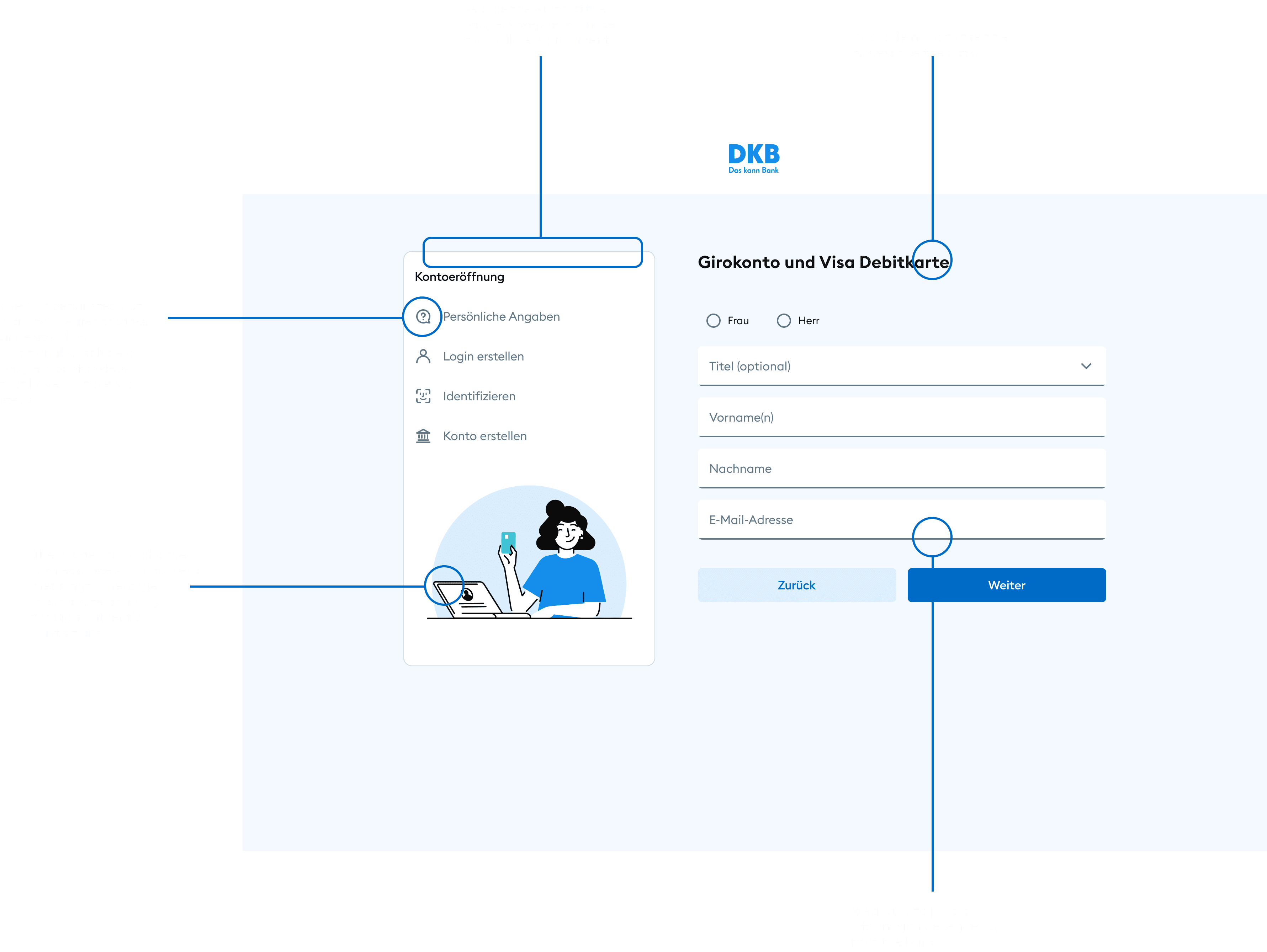
Highlighting issues in single screens
I incorporated user feedback from testing to improve the UI and UX of individual screens. Here is an example:
Headlines
Some headlines are misleading there is often a clear demand missing
Progress
Unclear for user how long it's gonna take for them to insert personal data. No steps showing.
Guidance
Unclear guidance between User 1 process and User 2 process
Example of improved screens
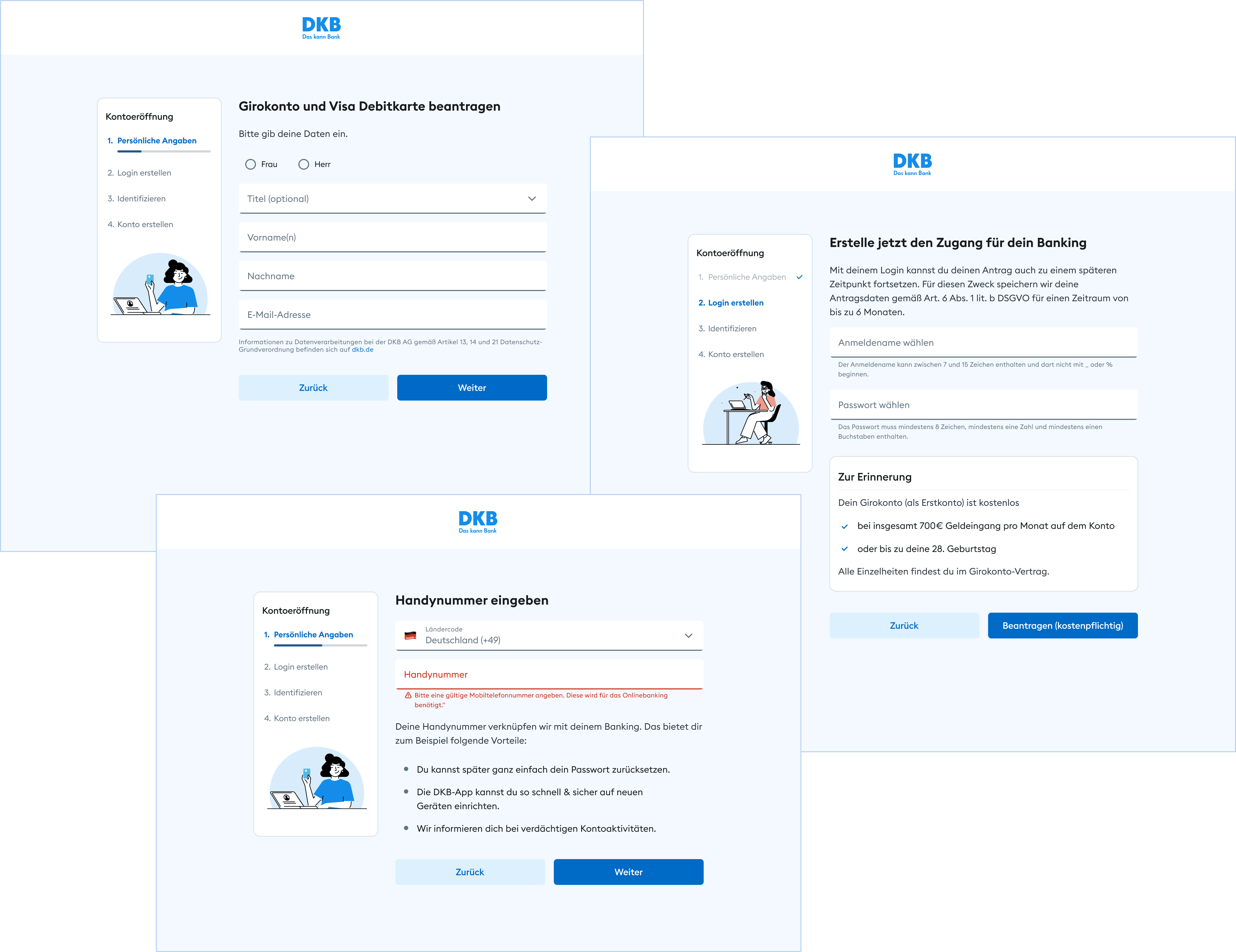
Clear titles with a demand what the user should do in this step
Improved the stepper with numbers and a progress bar, made it less prominent. Added branded visuals
Ensured all relevant error states were defined with meaningful assistive texts.
Added legal requirements on relevant screens
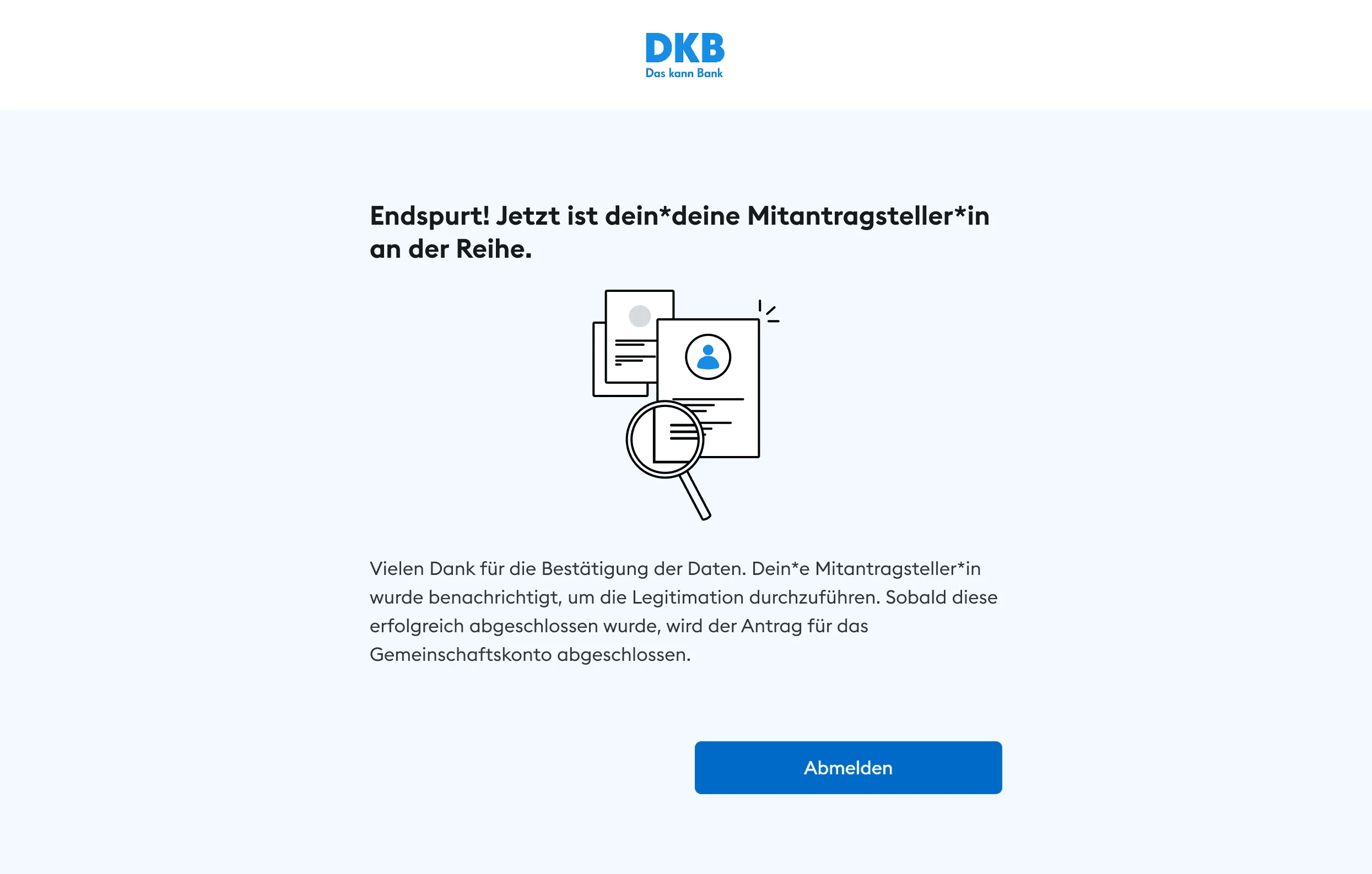
Clear guidance what the users need to do, e.g. "Now it's your friend turn, then you can finalize the account opening."
The onboarding experience supports a product with a large and growing user base, including over 120,000 new customers acquired in the following year.
Thoughts
Outcome
RESTRUCTURED
Cleaned up and restructured design files to ensure clarity and usability for developers and reduce ambiguity.
REDUCED FRICTION
Refined key screens (wording, layout, hierarchy) to improve clarity and reduce friction
INFORMATION HIERARCHY
The main challenge was structuring multiple dependencies, like new customer existing customer multiple users (Gemeinschaftskonto) into a clear and understandable flow.
COMPONENT IMPROVEMENTS
Based on user testing insights I improved the progress stepper. I additionally added branded visuals.