UI/UX
Testing
Quality control
Edge cases
Role
SR. UX Designer
Company
DKB Code Factory
Team
PO, Dev, QA
Platform
iOS, Android
Year
2023 2024
The onboarding flow had to cover edge cases, go through solid UX/UI quality testing and work with a third-party integration. Here is how I worked.
Off the Happy Path (Edge cases)
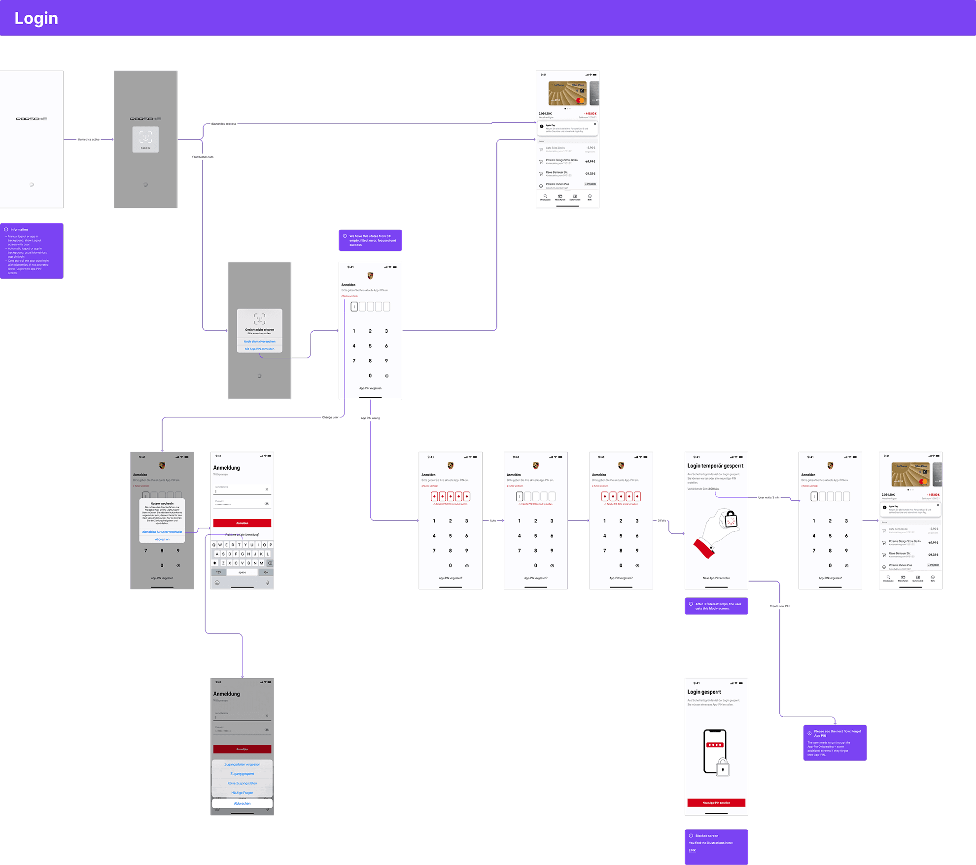
While building the MVP with the team, we started collecting and refining feedback and error cases. It quickly became clear that multiple edge cases needed to be documented and structured to ensure a consistent user experience.
RECOVERY SUCCESS
Users are able to successfully continue and complete the task after encountering an error.
SUPPORT TICKET REDUCTION
Fewer user questions and support escalations related to onboarding and verification.
IMPROVED DOCUMENTATION
Fewer open questions during development, minimized UX-related issues during development.
USER HAPPINESS
User wer happy to finally use biometrics for payments and login - reduced problems with forgotten passwords and sms.
TASK COMPLETION
Clearer copy, fewer drop-offs during verification, better guidance during the onboarding.
ACCESSIBILITY
Reduced frustration and hidden content if users had dynamic text on by setting rules for resizing content.
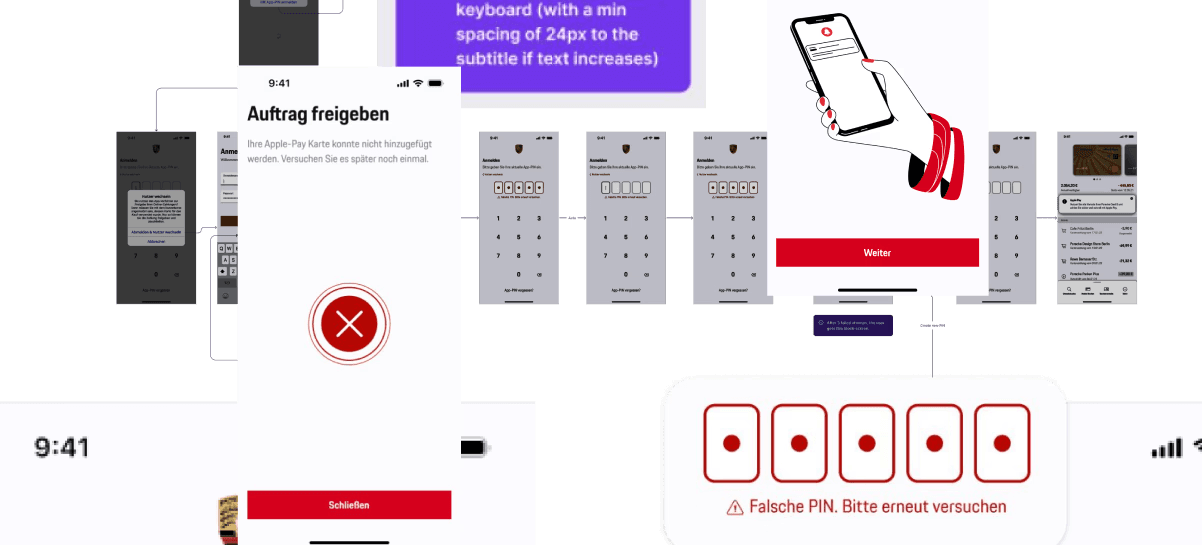
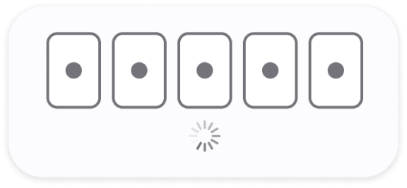
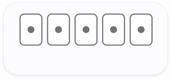
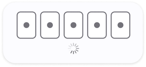
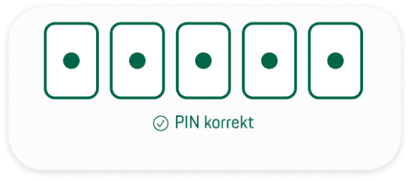
PIN input field
Challenge: Clear UX Writing, animation and haptic feedback, collaboration with 3rd party devs.

Clear states and error wording
Haptic feedback vibration and animation when wrong PIN
If user starts to type after the error, red warning disappears (“don’t overdo warning red”)
Loading indicators if backend takes a bit


Error cases
Some types of error the user can get in inputs, after a payment process or as a push
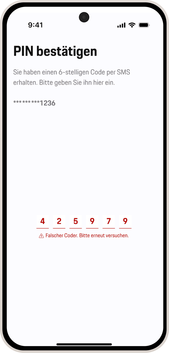
Clear wording: “Wrong sms code. Try again”
After a few seconds user can try again
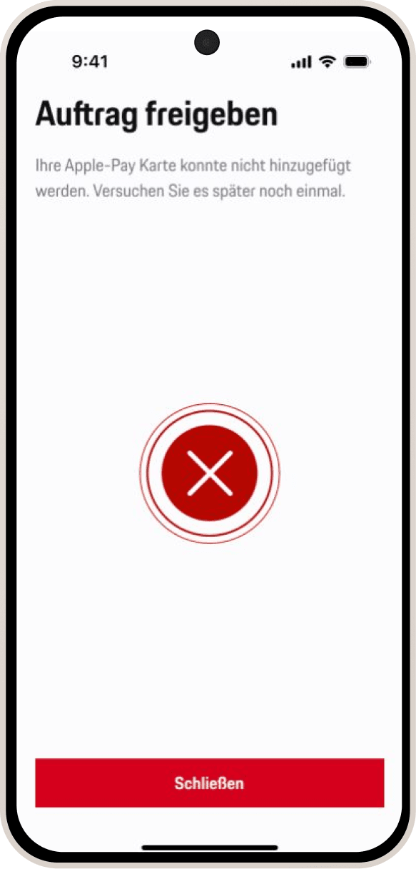
Error fullscreen for a process. eg. Apple pay to wallet
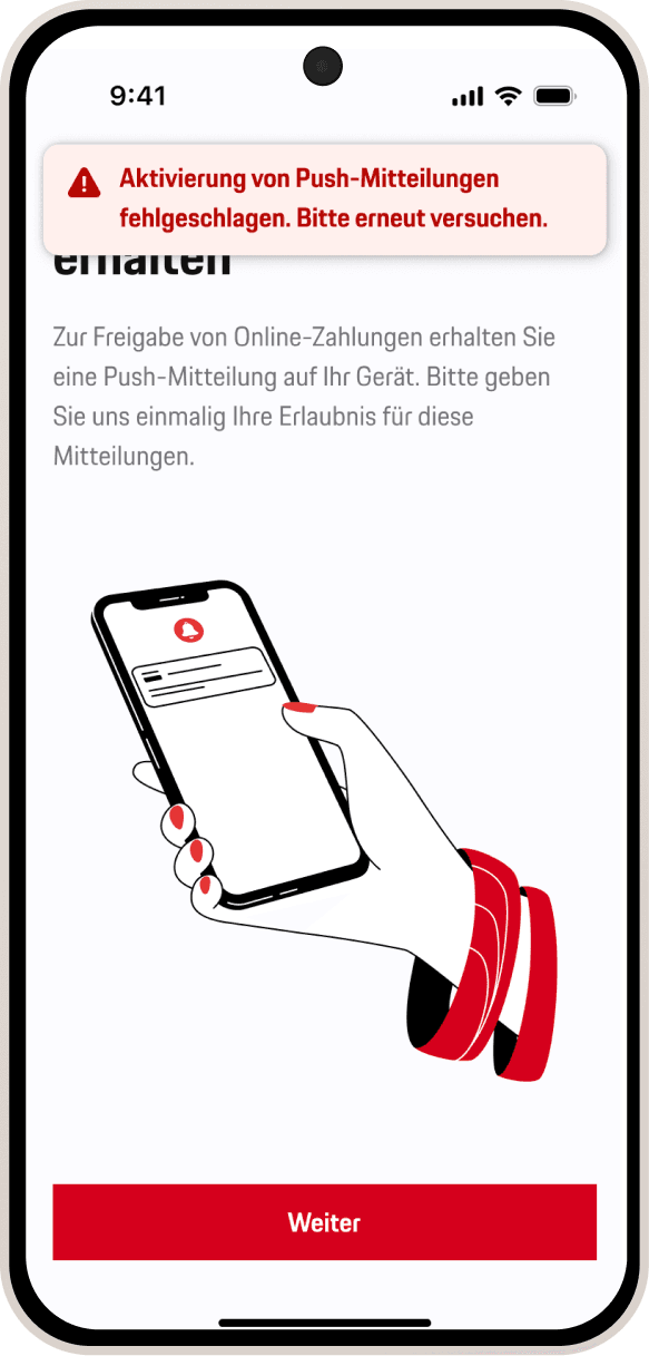
Error message toast for smaller errors eg. after OS-fail of activating push.
The issue
Errors can be produced by different factors. The problem in the old flow were to generic messages or even error codes. Users were often confused.
We can not cover all the cases or give the user always the exact reason. But we can give the user a clear message how to proceed.
Edge cases
What if? Together with the iOS and Android devs we tried to cover a wide range of edge cases
and to give the user the needed info and to avoid generic API-call errors . Some examples:
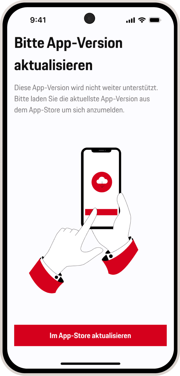
Give user information, if number is not available
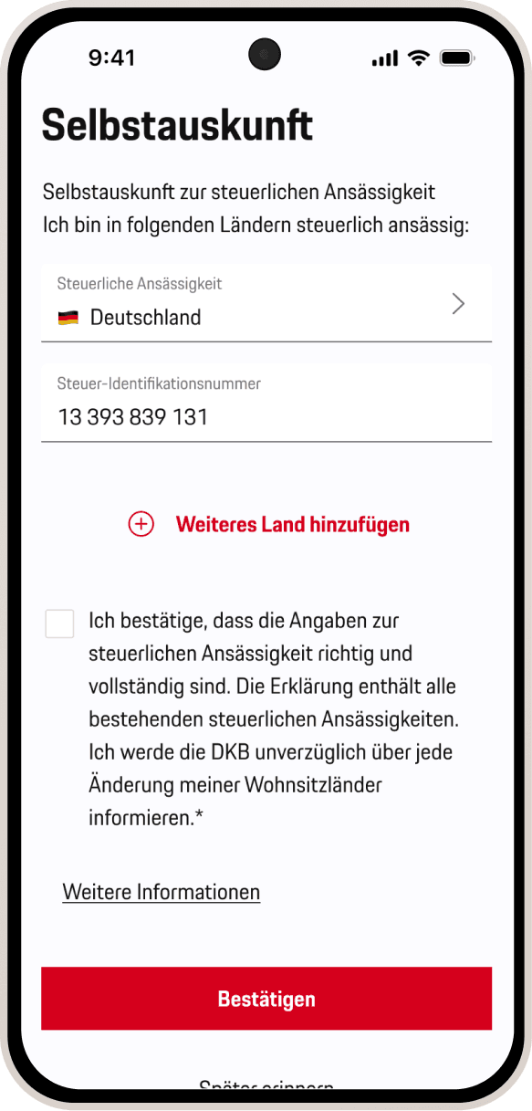
Tax residency update if requested by the bank
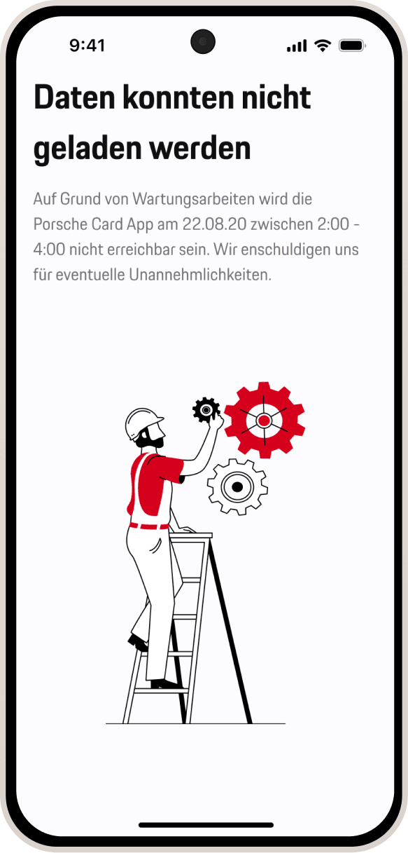
Maintenance of the servers
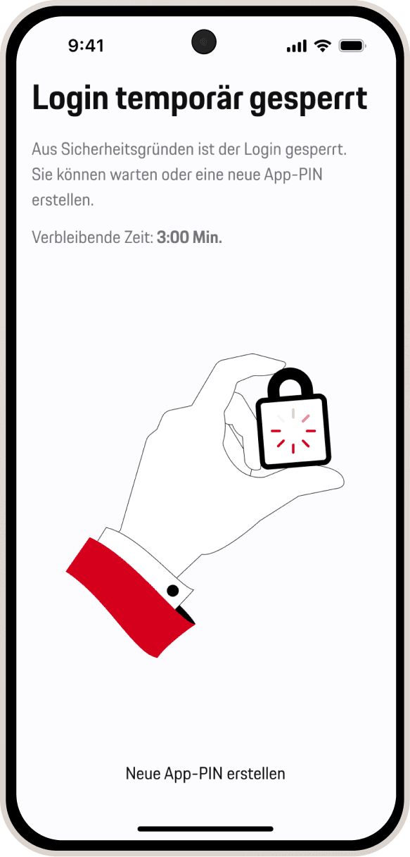
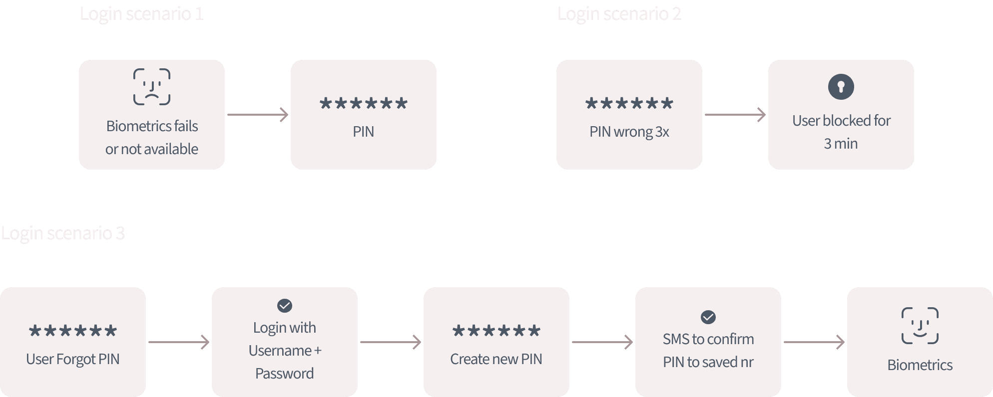
3x wrong PIN blocked screen with timer
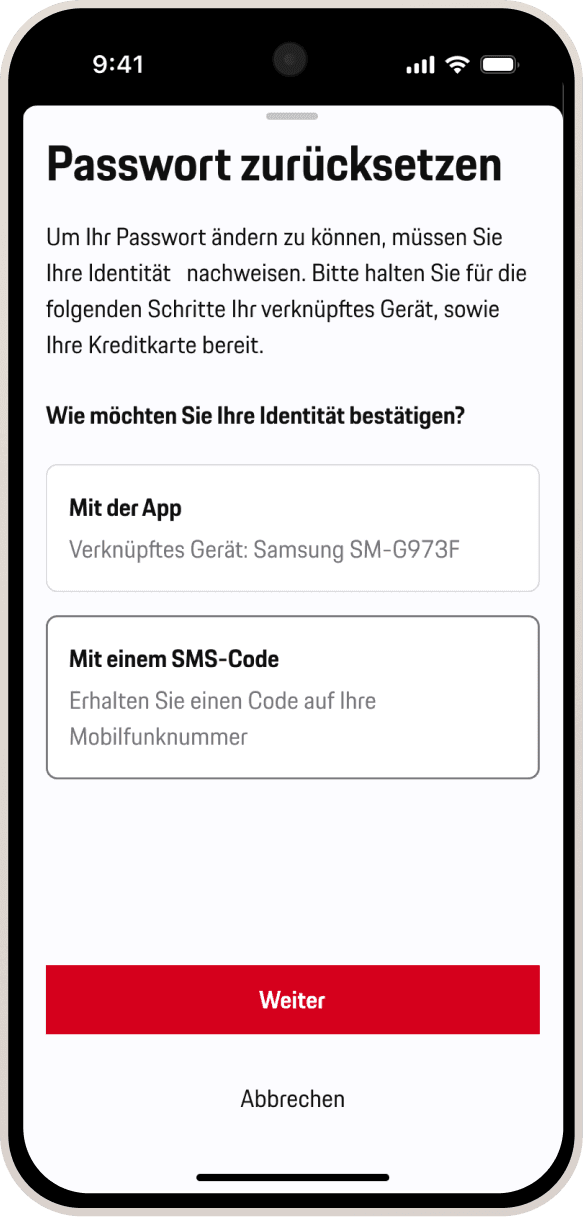
Reset password authentification with app or sms-code
Breaking It So Users Don’t Have To
Issues
No clear rules of how illustration resizes or scroll
Small screens & dynamic, bigger text: partly hidden content
Lack of accessibility
Goal
" transform="translate(5.769 2.044)" width="4.80488020049448px"/><path d="M 5.628 0.023 C 6.138 -0.092 6.643 0.238 6.755 0.759 C 6.868 1.28 6.544 1.796 6.034 1.911 C 6.034 1.911 6.033 1.911 6.032 1.911 C 6.031 1.912 6.028 1.912 6.025 1.913 C 6.018 1.914 6.008 1.917 5.995 1.92 C 5.97 1.926 5.932 1.934 5.885 1.944 C 5.791 1.966 5.659 1.996 5.507 2.031 C 5.204 2.101 4.828 2.189 4.526 2.262 C 4.071 2.374 3.359 2.726 2.794 3.184 C 2.497 3.425 2.295 3.848 2.039 4.523 C 1.905 4.876 1.868 5.444 1.907 6.119 C 1.945 6.782 2.04 7.355 2.089 7.786 C 2.152 8.335 2.377 8.838 2.684 9.734 C 2.911 10.399 3.204 10.804 3.572 11.07 C 4.047 11.412 4.602 11.618 5.288 11.907 C 5.506 11.998 5.845 12.06 6.287 12.066 C 6.717 12.073 7.186 12.026 7.623 11.946 C 7.889 11.897 8.102 11.777 8.337 11.584 C 8.461 11.482 8.58 11.37 8.724 11.234 C 8.86 11.106 9.025 10.949 9.203 10.806 C 9.677 10.427 10.023 9.95 10.508 8.873 C 10.919 7.961 11.031 7.314 11.084 5.8 C 11.1 5.329 11.124 4.838 11.096 4.365 C 11.067 3.874 10.987 3.549 10.886 3.373 C 10.622 2.913 10.773 2.32 11.223 2.05 C 11.674 1.78 12.254 1.935 12.518 2.395 C 12.851 2.976 12.95 3.677 12.984 4.248 C 13.019 4.836 12.989 5.442 12.974 5.869 C 12.917 7.501 12.787 8.438 12.227 9.681 C 11.686 10.882 11.184 11.677 10.37 12.328 C 10.264 12.413 10.155 12.515 10.01 12.652 C 9.874 12.78 9.706 12.94 9.521 13.092 C 9.136 13.408 8.635 13.725 7.954 13.849 C 7.423 13.946 6.833 14.007 6.261 13.999 C 5.701 13.991 5.094 13.916 4.567 13.695 C 3.997 13.455 3.177 13.151 2.482 12.65 C 1.71 12.093 1.218 11.309 0.898 10.374 C 0.664 9.689 0.305 8.841 0.21 8.01 C 0.174 7.697 0.061 6.967 0.018 6.233 C -0.024 5.511 -0.015 4.588 0.275 3.824 C 0.508 3.21 0.861 2.284 1.618 1.67 C 2.359 1.068 3.317 0.57 4.086 0.382 C 4.4 0.305 4.787 0.215 5.092 0.145 C 5.245 0.109 5.38 0.079 5.475 0.058 C 5.523 0.047 5.561 0.038 5.588 0.032 C 5.601 0.029 5.611 0.026 5.618 0.025 C 5.621 0.024 5.624 0.024 5.625 0.024 C 5.626 0.023 5.627 0.023 5.627 0.023 Z" fill="rgb(0, 102, 71)" height="14.000000000000004px" id="NaACzaWyi" transform="translate(1.236 2.044)" width="12.999999990113576px"/></svg>)
Clear resize rules for iOS and Android
Downsize illustration to a set minimum to avoid hidden content on the display
Better Accessibility
Resize illustration rules on iOS / smaller screens
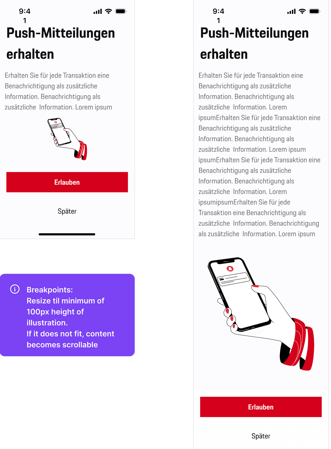
Illustration sizing: Illustrations vary in shape, so sizes are visually adjusted and don’t always use full width or height.
Padding: Minimum 16px padding on all sides.
Small screens / large text: If space is limited, content and CTA become scrollable to maintain a minimum illustration height.
Here’s the Figma… Good Luck
The Figma file served as the single source of truth, including flows, edge cases, and implementation details for developers was mine to make .
“It’s All in the Documentation”… Probably. . . but not always. That’s why we had also sparring sessions to clarify details and for better collaboration.
SOMETIMES EDGY
I understood the importance of designing resilient, defensive user flows for banking environments, with special emphasis on edge cases.
IOS VS. ANDROID ALIGNING
Due to technical limitations, Android required a different layout logic than iOS, with illustration widths set as a fixed percentage of the screen.
IMPLEMENTATION IS NOT ALWAYS DESIGN
Some issues are put into a ticket but then never touched - because “there is not much time and the devs need to move on situations”.
TESTING TILL IT BREAKS
The flow was tested extensively to ensure UX quality. Issues were documented with screenshots and shared clearly with both internal developers and external partners. This procedure was time-consuming.